Expedia
Usability testing in-lab to improve the “My Trips” feature at Expedia
Lab Usability Testing I Travel I Impact: Influenced product and design decisions
Expedia & UW
As a part of a graduate level Usability Testing Course at UW, I collaborated with four other UW HCDE classmates to conduct in‑lab usability sessions. These sessions sought to help travelers plan and manage full itineraries on Expedia that informed key enhancements to the Trips feature in partnership with our Expedia sponsor.
The Problem
Expedia’s My Trips feature helps travelers organize their bookings, but past feedback and behavioral data had indicated some areas of friction, especially around how users discovered and interacted with their saved itineraries.
The product team wanted to better understand where users were getting stuck (the pain points), how they expected the experience to flow, and what features would increase trust and utility. Our role as HCDE students was to uncover actionable insights through moderated in-lab usability testing, focusing on both short-term usability fixes and longer-term strategic improvements.


Approach
To evaluate how users navigated the My Trips experience, we conducted in-lab moderated usability testing. We recruited a mix of new and returning Expedia users who were asked to complete key tasks related to planning, viewing, and managing trips.

We combined think-aloud protocols, task success metrics, and post-task UEQ (User Experience Questionnaire) surveys to get both behavioral and attitudinal feedback.


Key Insights
Our research uncovered several usability issues, including:
Poor visibility of the map icon, leading users to miss saved hotels when viewing trips.
Low engagement with the “past trips” feature, stemming from unclear labeling and low perceived value.
Inconsistent mental models—users expected “Trips” to include both booked and tentative plans, not just confirmed reservations.

Impact: How much trouble does the usability issue affect user experience?
Frequency: # of participants encountering the problem
Persistence: How many times does a user get affected by the usability issue?
Impact
After presenting this work to the Design and Research team at Expedia, several usability improvements were implemented following the study…
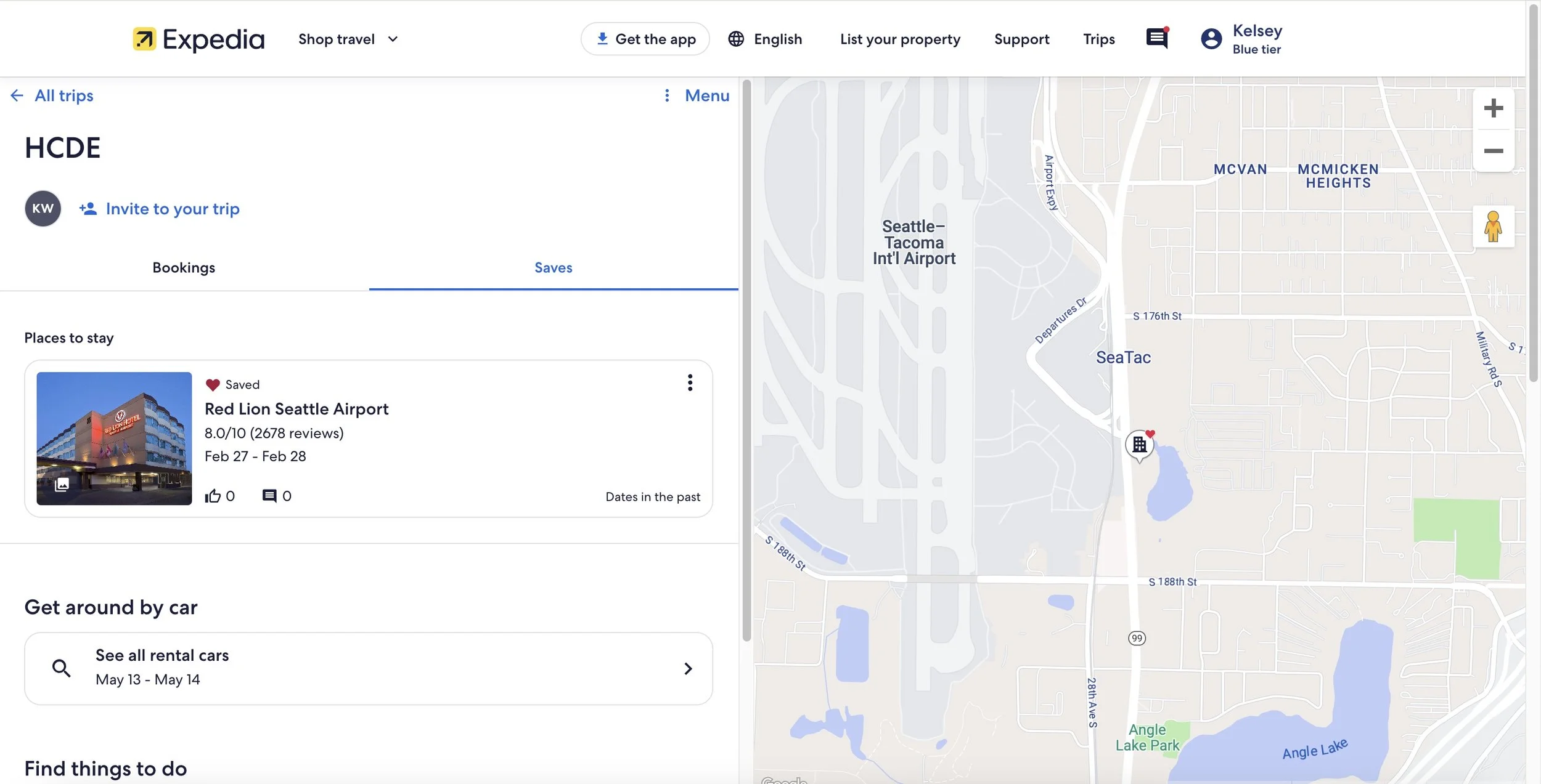
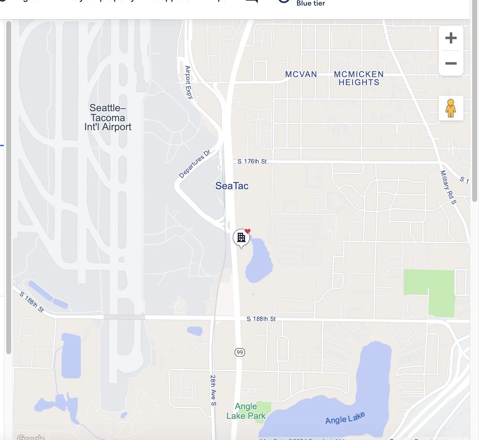
Updated Map Features
From our finding that the map display does not offer helpful features to trip planners on Expedia, the team added hotel icons for the favorited hotels in the trip to the map, allowing users to explore where they will be staying on their trip.
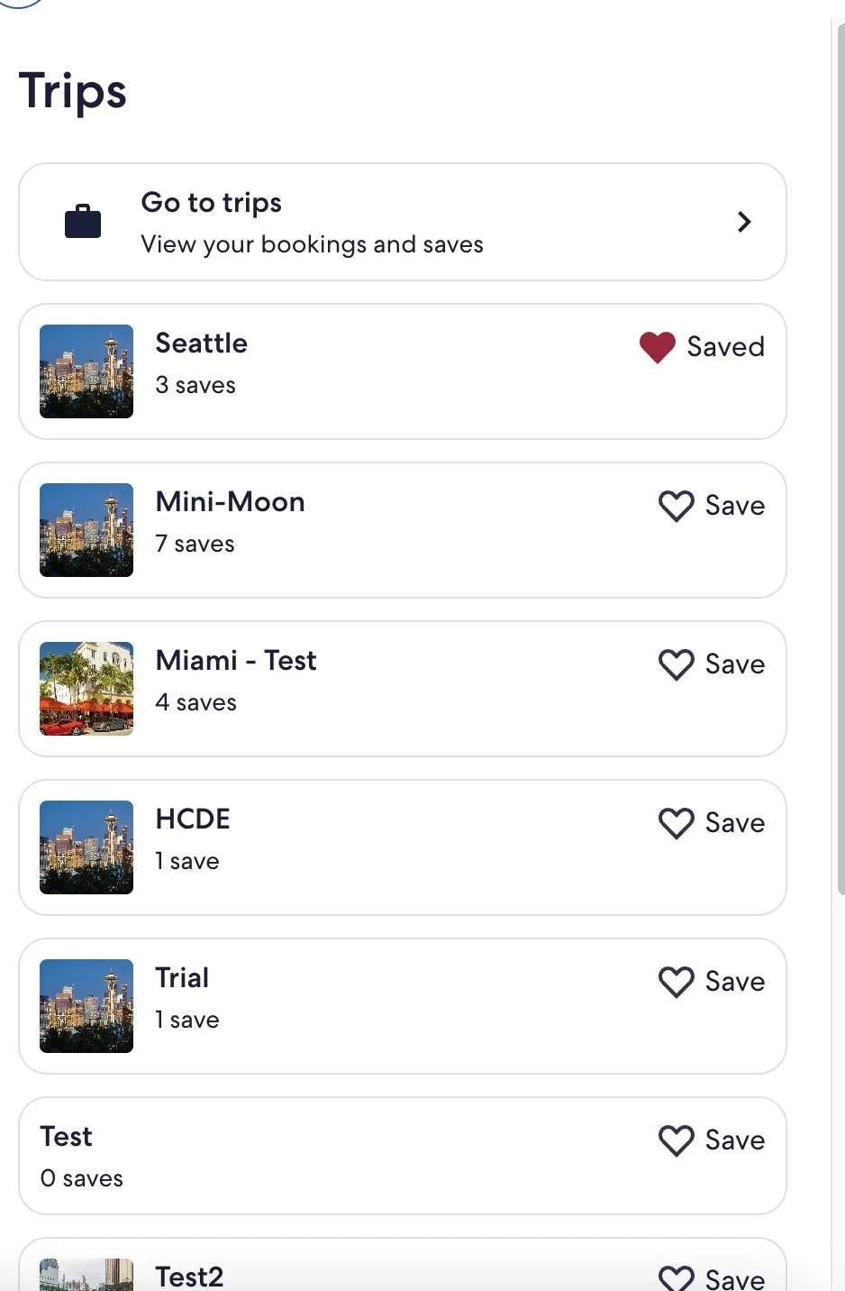
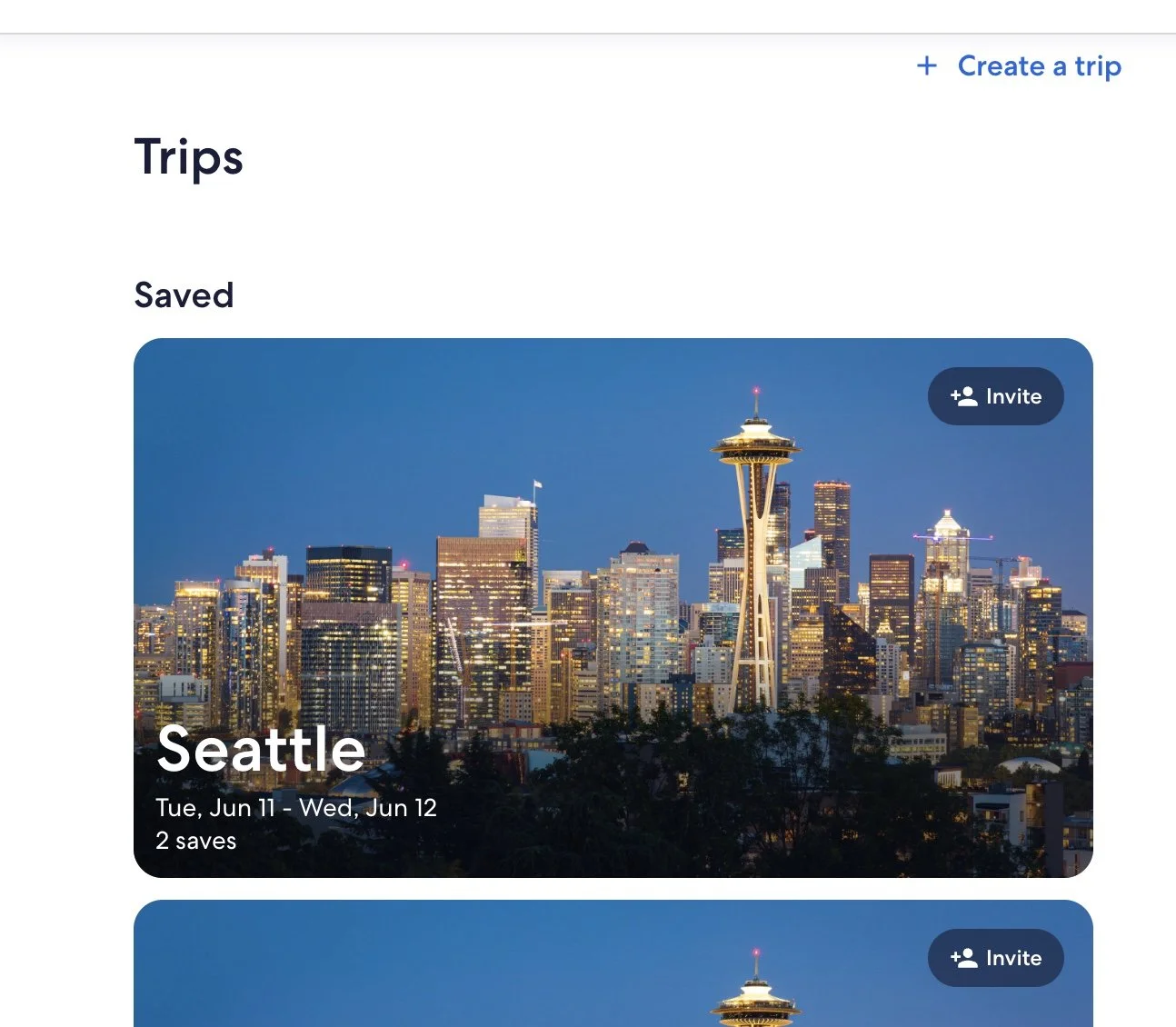
Easier Trips Comparison & Collaboration
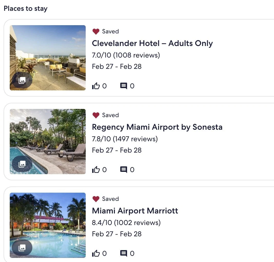
Trip detail cards for Stays were improved to include photos and collaboration features (like and comments) to more easily compare stays in the Trips page.
Improved association with “heart” and saved trips
We found that when saving a hotel, oftentimes the “toast” at the bottom goes unnoticed and users had trouble associating the heart with the “Trips” feature. To combat this issue, the team added a “drawer” feature when clicking on the heart to improve the user’s relationship with these two features.
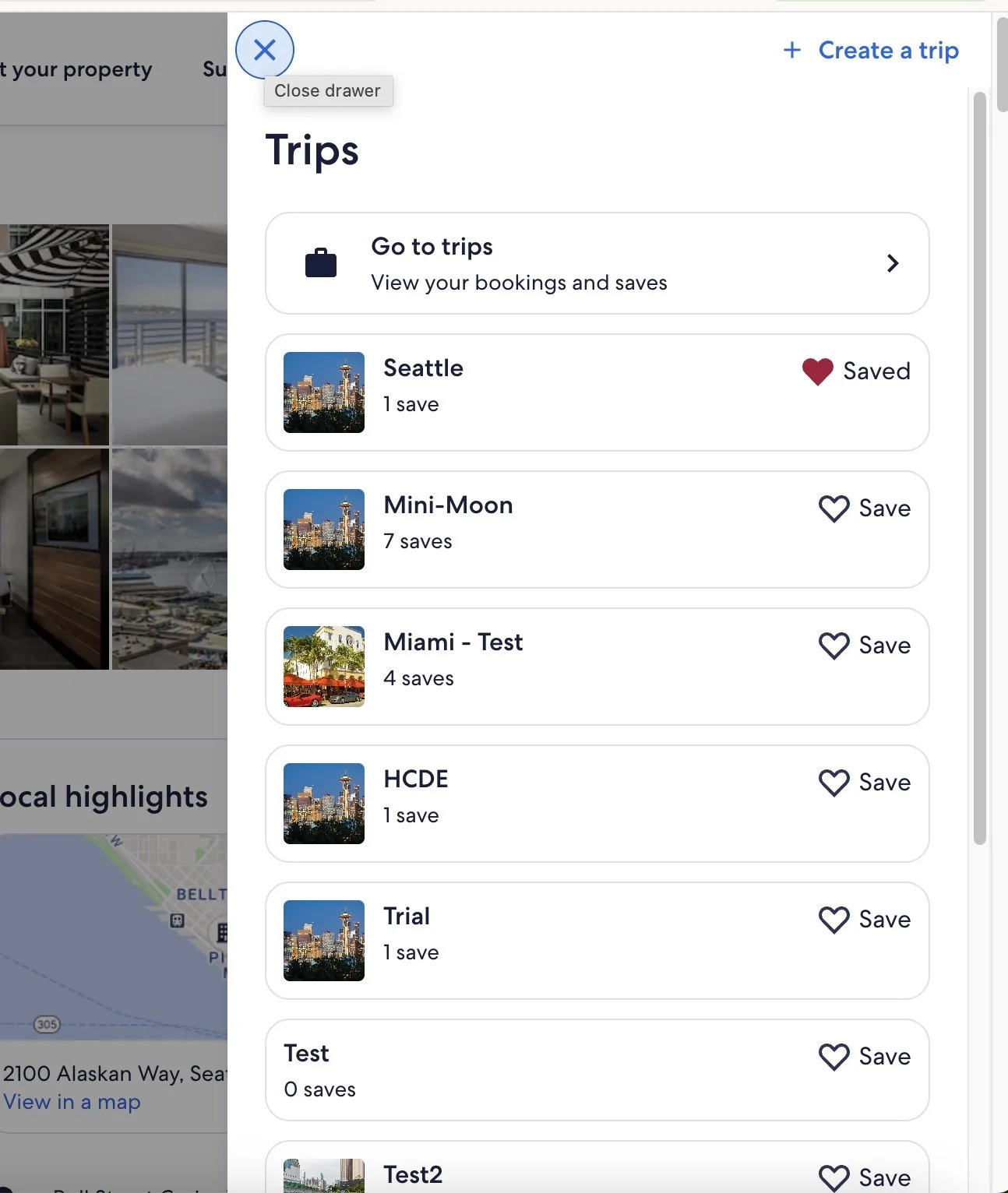
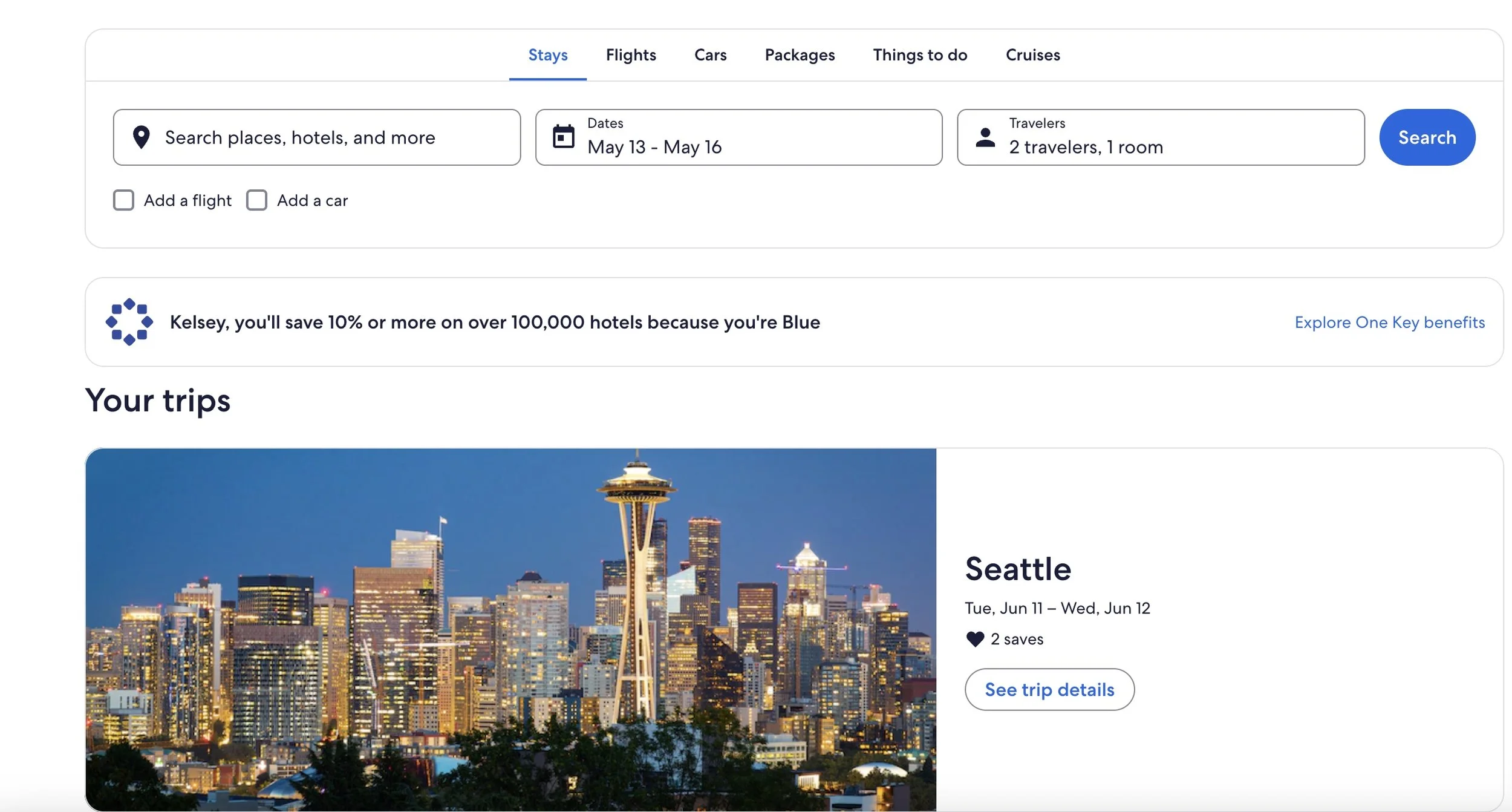
Improved “Trips” navigation and Findability
After our findings that the navigation to the Trips page was confusing for users, the team added “Trips” to the Expedia homepage, and added in more clear content around navigating the the Trips page.
My Role
I collaborated with my four other team-mates to design, moderate, analyze and present the end-to-end research process. As the only team-member with UX research experience i helped lead the team on:
Designing and facilitating moderated in-lab sessions
Created the moderator guide and participant tasks
Analyzing starategy
Packaging usability findings for sponsors
Reflections
This project gave me hands-on experience with key usability and HCI research practices in a real-world lab environment. Working in Expedia’s in-house usability lab reinforced how observing user behavior in a controlled setting produces rich insights that you can’t always glean solely from remote or unmoderated studies.
Key takeaways for me:
Behavioral measures matter: Task completion rates, click patterns, and frustration indicators proved powerful when paired with think-aloud protocols and post-task ratings.
Strong research planning is essential: A clear moderator guide, task script, and analysis framework accelerated synthesis and made reporting large data-sets far more manageable.
Bridging academic methods with sponsor needs: Conducting this as part of my graduate course while working with a real product team helped me appreciate how academic rigor and business relevance intersect.
In hindsight, I’d build a lighter exploratory phase before the lab sessions, using quick remote or guerrilla testing to narrow themes and refine tasks ahead of the lab. Overall, this experience affirmed that usability testing isn’t just about finding what’s wrong, it’s about shaping how the team thinks about user behavior and making the invisible visible.